React Button Component with an Icon

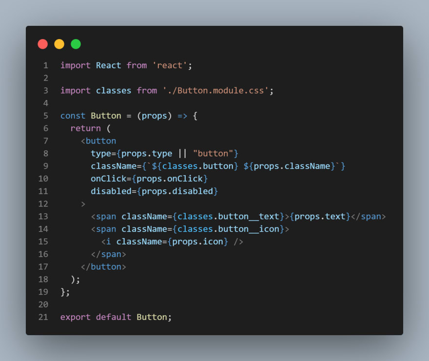
Creating a Button.js file to be imported as a component
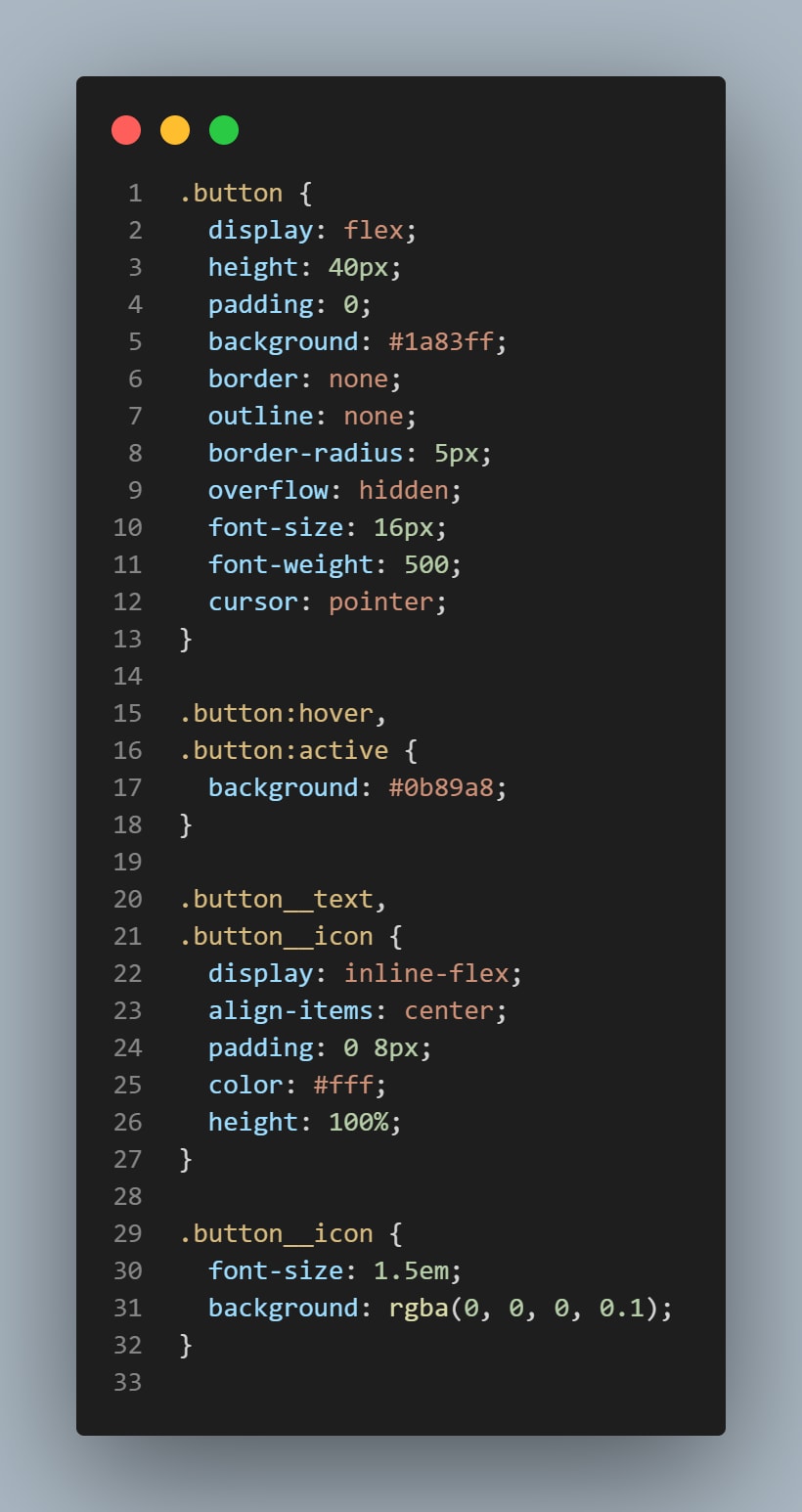
Creating a CSS file for the above mentioned component
As it is clear from the Button.js file that quite a few properties can be passed to the button component, you can always choose which properties you need to pass.
Major properties to be passed are the "text" and "icon" properties.
You can also add more CSS properties through className property. It can be seen on the 9th line of Button.js file image above.
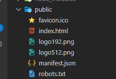
For icons, FontAwesome CDN has been used. The single line code is to be pasted in your main index.html file of your project which you will find in the public folder.
The CDN is to be pasted in the head tag of index.html file. Your CDN may look like the image given below:
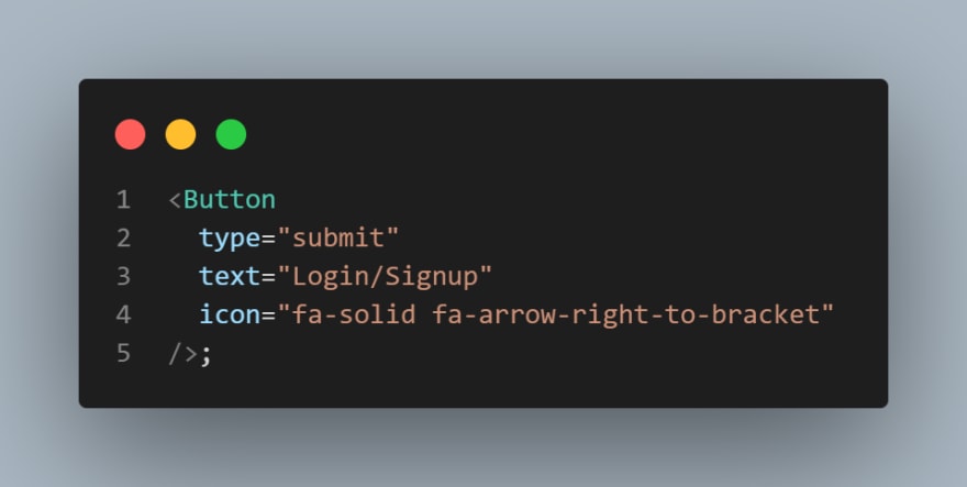
The component can be used as the image given below:
The class "fa-solid fa-arrow-right-to-bracket" is a font awesome class which you can explore on FontAwesome Website.
If everything is done right, your button will look something like this
So this is how you can create your own reusable button component with icon. The steps mentioned are React specific, if you find any difficulties creating your own Button component, please reach out to me on Twitter.


