Angular Library + Storybook
Storybook is a tool that allows you to easily create and document UI components. It works with several different libraries and frameworks, such as Angular, React, Vue, and many others.
Create a new workspace and library
To create a new workspace and a component library on Angular, run the following commands.
ng new my-workspace --create-application=false
cd my-workspace
ng generate library my-lib
When you create a new workspace, Angular automatically initializes a git repository. After generating a basic library, I recommend you commit your changes, just to keep things neat.
git add .
git commit -m 'generate library'
Install Storybook
Once you have created a new library, now you can run the storybook utility to get started. Run the following command.
npx sb init
This should take a few minutes. This command will run the Storybook CLI, which should automatically detect the framework or library where you're installing Storybook on and create the basic configuration for it.
See: Storybook - Install
After configuring storybook make sure the .storybook/tsconfig.json file is extending the library tsconfig.lib.json. The extends property in your .storybook/tsconfig.json should look like this.
{
  "extends": "../projects/my-lib/tsconfig.lib.json",
}
Commit your changes again.
git add .
git commit -m 'install storybook'
Adding the Storybook project to the workspace
Before running Storybook, you have to add it to your Angular Workspace, so that Storybook knows where to look for possible additional configurations you might need. This will be analogous to when you create an Angular application in your workspace, but in this case we don't want to create a native angular application, just a default configuration for Storybook to use, where we can later add other settings later, like global css styles, for example.
Add the "storybook" setttings in the code below to the "projects" property in the angular.json file.
{
  "projects": {
    "my-lib": { ... },
    "storybook": {
      "projectType": "application",
      "root": "stories",
      "sourceRoot": "stories",
      "architect": {
        "build": {
          "options": {
            "tsConfig": "tsconfig.json",
            "styles": [],
            "scripts": []
          }
        }
      }
    }
  }
}
Running Storybook
Once the Storybook CLI has finished setting up a basic configuration in your Angular workspace, you will be able to run storybook by running the following command.
npm run storybook
Rendering a library component
Once you run storybook, you will see some default example components which come with Storybook, however what you most certainly want is to be able to render and develop your own library components using Storybook.
For this example let's use the default component which has been created when we created the library, MyLibComponent.
Adding an alias to the main library entry point
Creating aliases for the library entry points is very useful at this point. This will ensure that the path used to import your components to your stories will be the same the devs will use once you publish your components library on npm.
To add the main entry point to the tsconfig.json follow the example below.
{
  "compilerOptions": {
    "paths": {
      "my-lib": ["projects/my-lib/src/public-api"]
    }
  }
}
By default the "my-lib" path points to the dist folder of your library ["dist/my-lib/my-lib","dist/my-lib"], which means you would have to build your library before pointing to the components inside it. While that might sound like a good idea at first, that introduces one unnecessary step to your development process which also causes several issues on Storybook, since it was not written with compiled components in mind.
You are better off letting Webpack dynamically compile your library components during development. It simplifies your workflow and you will have a better experience developing on Storybook.
I highly recommend you keep the library compilation and build test process in a separate workflow, and use npm link to test it in your applications before publish it, but that's whole new story.
If at some point you need to create a secondary entry point you just have to add it to the
"paths"property. E.g:"my-lib/secondary": ["projects/my-lib/secondary/public-api"]
Creating a new story
Now that you have created an alias which points to the library components we can import and use them in a new story.
In the folder stories create a new file named my-lib.stories.ts.
import { Story, Meta, moduleMetadata } from '@storybook/angular';
import { MyLibComponent, MyLibModule } from 'my-lib';

export default {
  title: 'Example/MyLib',
  component: MyLibComponent,
  decorators: [
    moduleMetadata({
      imports: [MyLibModule],
    }),
  ],
} as Meta;

const Template: Story<MyLibComponent> = (args: MyLibComponent) => ({
  props: args,
});

export const Default = Template.bind({});

Default.args = {} as Partial<MyLibComponent>;
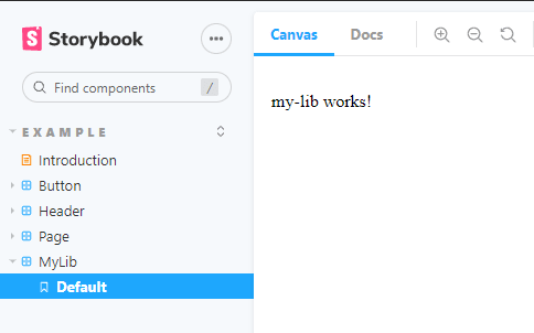
We don't really need to import the MyLibModule here since MyLibComponent doesn't really have any major dependency. It's just a simple component which says "my-lib works!", but I left this just as an example of what you usually might need to create a simple story. That's basically it.
If everything went well, it should render like this:

Here is the git repository with the code for this post.

